
When you are ready to get started with your Form Builder subscription, click here to fill out our short form! Try out the Form Builder today FREE for the first 14 days!
An Overview
The Form Builder is a powerful tool that will allow you to build forms of all kinds to host on your website or send directly to a client using a URL. Through these forms, you will be able to automatically create events in Details that will include the information they provided in the form through data mapping!
You will also be able to create Static Pages: landing page-style forms allowing you to provide information to your clients, such as an 'About Us' page of your employees or a gallery of your past event photos.
Custom Subdomains
Forms can, optionally, be hosted at custom subdomains of your choice. That means the link your forms are accessed at can start however you'd like, perhaps using your company name instead of having the phrasing 'details.flowers' at the beginning. This is a great opportunity for you to continue branding your company and your growth to success.
If you would like to choose a subdomain, please fill out this form, and our Support Team will contact you. There are many combinations to choose from; however, they are first-come, first-served, so we may not have the exact URL you request if it's already been claimed by another account.
Accessing the Form Builder
To access the form builder, follow these steps:
- Click the main menu in the upper left-hand corner
- Select 'Form List' from the available options
Creating Forms
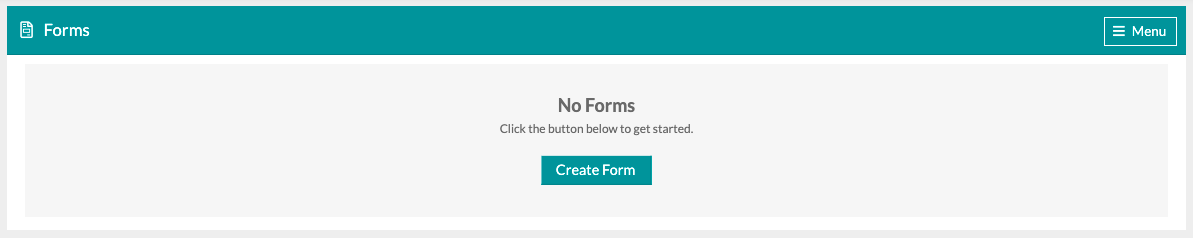
When you first arrive at the Form Builder home, this is what you'll see. Click the 'Create Form' button to get started. If you'd like to request a custom subdomain, you'll find that option within the 'Menu' button in the top-right corner.
Click the 'Create Form' button to open the Form Settings modal window where you'll name the form and select from a few options for how the form should function. Let's take a look at the Form Settings!
- General
- Form Name: Use this field to enter a name for your form. This name will be displayed here in the list, but it will also be displayed as the verbiage displayed on the browser tab or window at the top of the screen, so keep in mind that your clients will see what it is called.

- Active: Use this toggle to switch the form on or off. We'd recommend only switching it on once you've finished creating and configuring the form.
- Static Page: Static pages allow you to create a landing page-style form with no questions. These types of forms are best used to create galleries of past event photos, About Us pages, etc. Learn more about static pages by clicking here!
- Create Event: Use this toggle to indicate whether or not you'd like form submissions to generate events in your account. For example, if a prospective client fills out a form to book you for an event, enabling this option will automatically create that event and attach the information submitted through the form to it.
- Form Name: Use this field to enter a name for your form. This name will be displayed here in the list, but it will also be displayed as the verbiage displayed on the browser tab or window at the top of the screen, so keep in mind that your clients will see what it is called.
- Advanced
- Open Date & Close Date: Use these fields to select a date range that the form should be active during. If left empty, the form will be active whenever the 'Active' toggle is switched on.
-3.gif?width=300&name=ezgif.com-gif-maker%20(6)-3.gif)
- Open Date & Close Date: Use these fields to select a date range that the form should be active during. If left empty, the form will be active whenever the 'Active' toggle is switched on.
-
- Multiple Submissions: Each submission requires a unique email address as a verification method. By default, visitors are limited to one form submission, but enabling this function will allow an individual to create a submission multiple times using the same unique identifier (i.e. their email address).
- Created Event Name: This is a great example of where we encourage you to use a feature called 'Tokens' to create a custom event name that will be automatically created using information the client enters on the form. To learn more about your token options, click here!
Note: the 'Created Event Name' field will only appear if you have toggled on the 'Create Event' toggle within the 'General' tab of the 'Form Settings.'
-
- Slug: A URL slug is the part of the URL or link that comes after the domain extension. For example, 'details.flowers/this_is_a_slug'
Note: This field will only appear if you have selected a custom subdomain.
After a form has been created, it will be listed on the Form Builder home page, and these Form Settings can be accessed and adjusted at any time by clicking on the pencil & paper icon on the left side, as seen below.

Building a Form
Forms are built out using a series of varying fields that you'll create, customize, and map into Details. This part of the platform is almost completely open-ended, and it's up to you to design and build the forms to your needs.
Your account will come pre-loaded with two template options. To access these templates, you will begin creating a form. Once on the form page, it will ask if you would like to start from scratch or a template. Select 'From a template' to see your available template options!
Forms comprise Field Elements, which can be mapped to Field Values.
Elements are the varying kinds of input fields that you include in your forms to allow respondents (your clients responding to your forms) to provide information.
Values are where the information the respondents provide goes. The value is which event or client property that response is sent to. So, when somebody enters their name, their response might be mapped to the first and last name fields on the contact record associated with an event.
Form Defaults
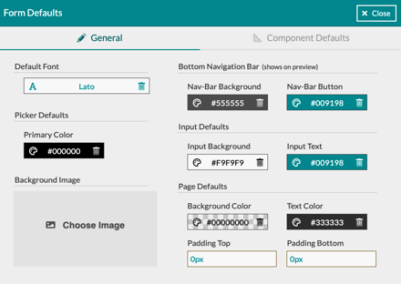
Each form allows you to enter in custom defaults to see all of your elements and pages. For example, your business likely has brand-specific colors you like to use every time or certain fonts you like best. You can add these defaults to your form so that every element and page added to your form is completely uniform! Let's dive into the available options:
- General
-
- Background Image: This will allow you to set an image for the background of your form across every page.
- Picker Defaults: This will be the default color for your 'Date Picker' and 'Color Picker' elements
-
- Bottom Navigation Bar: The navigation bar is located at the bottom of your screen and will host your client's navigation buttons. You can change the color of the bar background and the button itself.
- Input Defaults: Input fields are the fields that your client uses to type in or select their answer. Here, you can change the input background and the text color for your input fields.
- Page Defaults: Here, you will be able to select a background color for your form, the text color for your field titles, and add any padding to the top and bottom of your form
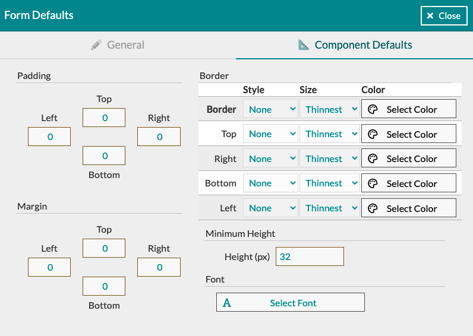
- Component Defaults
- Padding: This will add additional space around the elements themselves
- Margin: This will add additional space around the outside edges of the form itself
- Border: Add a border to your entire form or around any individual side
- Minimum Height: This is the minimum height for your elements within the form
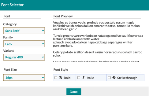
- Font
- Category: Here, you will find major typefaces, such as 'Sans-Serif' or 'Handwriting.'
- Family: Each category has a selection of font styles to choose from.
- Variant: Here, you can set your font will different variants such as 'bold' or 'Italic'
In addition to setting your form defaults, you also have the option to change colors, fonts, and more per element from the edit menu.
Field Elements
Let's take a quick look at each of the form element types and what their uses are:
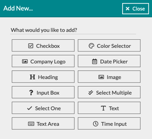
- Checkbox: This component allows you to include a checkbox (or toggle) for respondents to include simple yes or no responses. For example, a question might be: 'Would you like to receive emails about our products and services?' and then respondents would check or toggle a switch to indicate their preference.
- Color Selector: Let your respondents select their own colors for the event! This is the same Color Selector you use within your Details account, but it's for your clients to use and select the colors for their events. It is also compatible with mobile!
- Columns: Use this component to put fields side-by-side in columns. This is a great way to fill out your pages in an organized manner. Add components within the column component, the same as you would add them regularly.
- Date Picker: Include this component to allow respondents to pick their event date from a calendar.
- Heading: Use this component to add headers to your pages.
- Image: Use this component to add an image to your form, such as your logo.
- Input Box: This component will likely be the most used on your forms. It's a generic input field that can be mapped to nearly any event or contact properties in Details. use this for names, phone numbers, contact info, or nearly any short open-ended question you can think of!
- Select Multiple: This checkbox field allows respondents to select from various custom options you determine. In one of our form templates, we allowed respondents to select the theme/styling keywords for their event, such as 'Modern' or 'Elegant.'
- Select One: This is a drop-down field used to allow respondents to select an option from multiple, such as selecting what kind of event they'd like to book from a list of options you'll determine.
- Text: This field inserts the text you'll write into your intake forms. There are no input options for respondents; it's simply a field to enter descriptive verbiage you'd like to include with your form.
- Text Area: This component allows respondents to give longer-form answers to open-ended questions. For example, you could ask a client to describe their vision for the event and allow them to use this field type to enter a few sentences.
- Time Input: Similar to the Date Picker, this field allows respondents to select specific times for things like ceremonies or receptions!
Any of these components may be added to a form, in any order you desire, and they can be used to map responses into various event or client-related properties. Additionally, you can also set up these inputs to map to custom properties.
Custom Properties
Events may be assigned custom properties for whatever you'd like. A common example we've seen used is a field to track an event budget. If you're unfamiliar with Custom Properties in Details, we recommend checking out this Support Center article on Custom Properties for a full breakdown.
Field Values
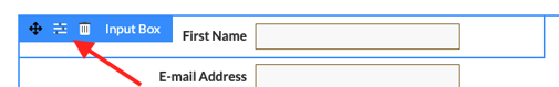
As previously mentioned, values are where the information the form respondents provide goes. Values are mapped to event or contact properties, like event date or contact name. To change the field label, set a value, or change the element's colors and fonts, click on the edit icon for that element. It will look like this:
Now, let's go over your value options for each field element:
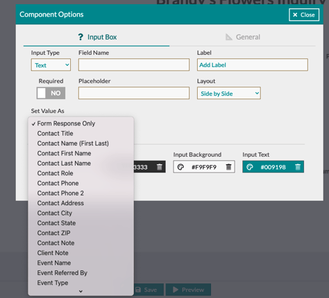
Input Box
- Text: This is a plain text field, best used for one or two-word responses, up to short sentences. A good example of how this should be used for gathering information like a name or address. You can map these values to the following fields in Details:
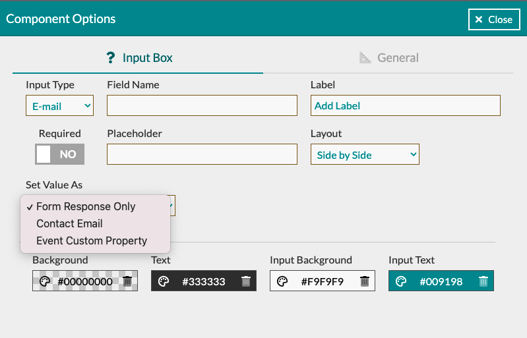
- Email: Use this element to gather your client's email (pretty simple, right?!). You can map these values to the following fields in Details:
- Number: Use this field for any numeric answer. For example, if your client is filling out a form for their upcoming anniversary party, a question such as 'How many years are you celebrating?' You can map these values to the following fields in Details:

- US Phone: Another straightforward option. This is used to collect phone numbers from your client. You can map these values to the following fields in Details:

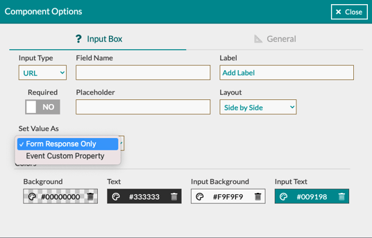
- URL: Use this field to allow your clients to add cloud-based documents, Pinterest pages, and more! You can map this value into the events 'Custom Property' or keep it select 'Form Response Only':
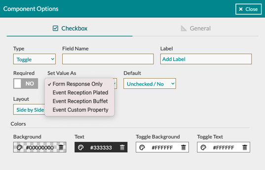
- Toggle/Checkbox: This option will allow you to select either a toggle or checkbox option. Both of these options will allow for the same mapping options to Details. You can map these values to the following fields in Details:
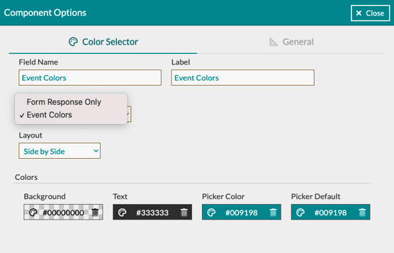
- Color Selector: This element gives your client the option to select their event color story. You can map these values to the following fields in Details:
-
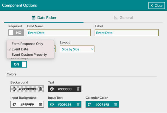
Date Picker: Here your client will be able to select any important dates for their event. You can map these values to the following fields in Details:
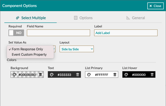
- Select Multiple: Use this element to give your client options, such as the overall theme or style of their event. You can map these values to the following fields in Details:
-
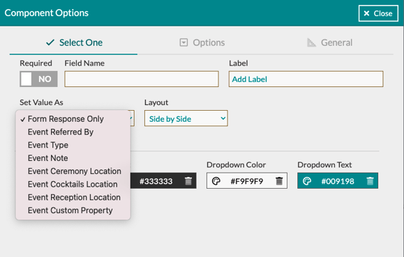
Select One: Use the 'Select One' element for information such as the type of event they are hosting or how they found your company. You can map these values to the following fields in Details:
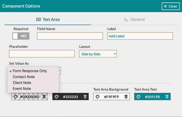
- Text Area: Use this section to gather additional information the client may want you to know about their vision or notes about the clients themselves. You can map these values to the following fields in Details:
-
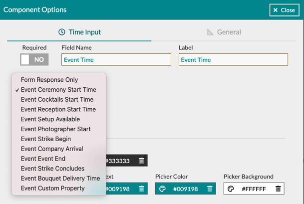
Time Input: Use this field to get an understanding of the timeline for the event. You can map these values to the following fields in Details:
Company Logo
Add this element to your forms to automatically populate the logo you have listed in your 'Company' settings.
Saving Versions & Templates
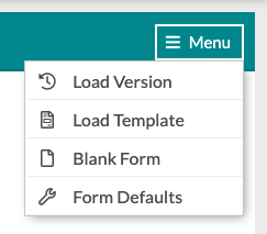
Similar to how you save versions and templates or your 'Worksheet' and 'Event Terms', you will be able to save versions and templates of your forms. The process for this is the same as on the 'Worksheet' where you will click the 'Save' button at the bottom of the screen and select if you want to save it as a version or a template.
Templates and versions can be found in the 'Menu' in the upper right-hand corner of your form.
Adding Pages To Your Form
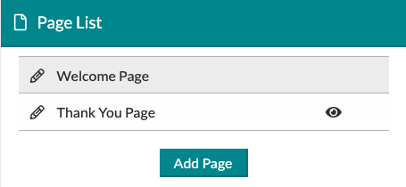
Each form will start off with a 'Welcome' page and a 'Thank You' page. To add additional pages, click the 'Add Page' button within the 'Page List' section.
From here you can also edit your individual page settings. Previously we discussed that you can make defaults for every page of your form but you can also adjust certain fields per page. To edit the page, click on the pencil icon next to the page name.
Finalizing Your Form
Before sending your form off to a client or hosting it on your website, we always recommend previewing the form to see what your client will experience when they look at it. At the bottom of the form, you will see an option to 'Preview' the form. This will take you to the full-form preview, where you can see what it will look like from a mobile device, a tablet, or a computer.
To view each device type, click the blue square in the upper left-hand corner and click on the device you wish to view. Watch the short clip below for a demonstration of this process.

Using Your Form
Once you have completed your form and you are ready to host it on your website or send it off to a client, head back over to your 'Form List'. Next to the form name, click the eye icon to navigate over to your live form where you can copy the link to use where you would like!
Note: Your 'Open Date' cannot be a future date if you plan to access your form right away. The eye icon allowing you to grab your form link will only appear if there is a valid 'Open Date'.
Form Submission Alerts
Once a client has filled out your form, you will get an alert to the email listed in your 'Company Info' notifying you of the submission similar to how you receive your Proposal signed notifications. In the email you will have a link to go directly to their form response page to review.

Support
This article contains a lot of information, which can be overwhelming at first glance. If you have any questions about the 'Form Builder' and its many functions, please don't hesitate to contact the Details Support Team at support@detailsflowers.com or by using the chat feature in the bottom left-hand corner of Details.